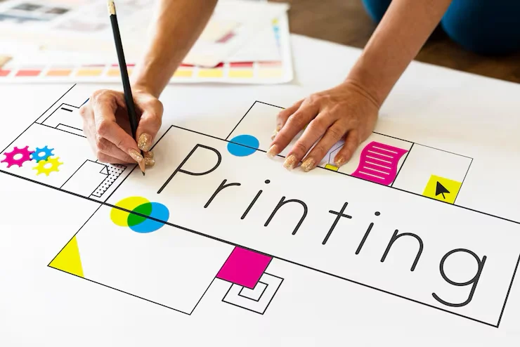
Print Files 101: Why Is Your Business Card Blurry?
Why did the print shop reject my file? Color spaces and bleed explained. How to avoid a €1000 printing mistake.
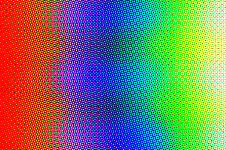
Screens emit light (RGB — Red, Green, Blue); paper reflects it (CMYK — Cyan, Magenta, Yellow, Key/Black). That’s why your bright blue logo can look dull and muddy on paper if the file isn’t prepared correctly.
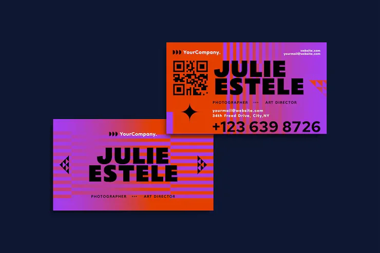
Vector vs raster: the eternal battle
A raster image (JPG, PNG) is made of pixels. Zoom in and it becomes blocky.
Vector graphics (AI, EPS, SVG) are made of math. You can print a vector logo on a postage stamp or the side of an airplane — it’s always razor sharp. Rule: Logos are ALWAYS vector. Photos are raster.
Bleed
Printing presses aren’t precise to the millimeter. If you want color to run to the edge of the paper, you must add 3–5mm of bleed.
Without bleed, you may end up with an ugly white strip on the edge of a business card. That’s beginner mistake #1.
DPI (Dots Per Inch):
On screens 72 DPI is enough. For print you need at least 300 DPI. If you print an image from the web, it will be blurry (pixelated) because the resolution is too low.
FAQ: Printing
Can I send a Canva file to print? +
Careful. Canva often saves in RGB. Always choose “PDF Print” and enable “Crop marks and bleed.” Even better — let a professional check the file.
What is Pantone? +
It’s a standardized color mix (like at a paint store). Coca‑Cola red always uses the same Pantone code (PMS 484) to keep brand consistency.
Save time and money
Don’t risk misprints. We prepare your files so the print shop praises you.
See print services →Angelina
Graphic designer / prepress
Graphic designer and prepress specialist with 5+ years of experience. Strong in branding, print materials, books and complete print workflows.
Learn more about the SIA DESIGN team →