Brochure Design 2026: From Flyer to Sales Tool
A well-designed brochure sells better than a banner ad. Fonts, formats, QR codes, print specs and everything else you need to know. From €80.
The brochure is one of the most underrated marketing tools. In an era when everyone talks about digital marketing, we forget that physical material — a flyer, a leaflet, a brochure — stays in someone's hands. Therefore, it can't be clicked away, it doesn't disappear from a feed, and it can be left on a desk. Consequently, it only works when it's well designed.
Why brochures still work in 2026
Digital noise has become so overwhelming that physical materials stand out. In addition, a professional brochure at trade shows, client meetings, or on an office desk builds trust in ways that banner ads simply cannot.
- Tangible — people hold it and therefore perceive quality.
- Focused — moreover, there are no side ads or pop-ups.
- Long-lasting — a good brochure can also live for months or years.
- Trustworthy — consequently, print material signals: this company is real.
💡 Good to know:
Studies show that print materials are remembered 70% better than digital ads. Specifically, physical contact activates memory-related brain regions that screens cannot reach.
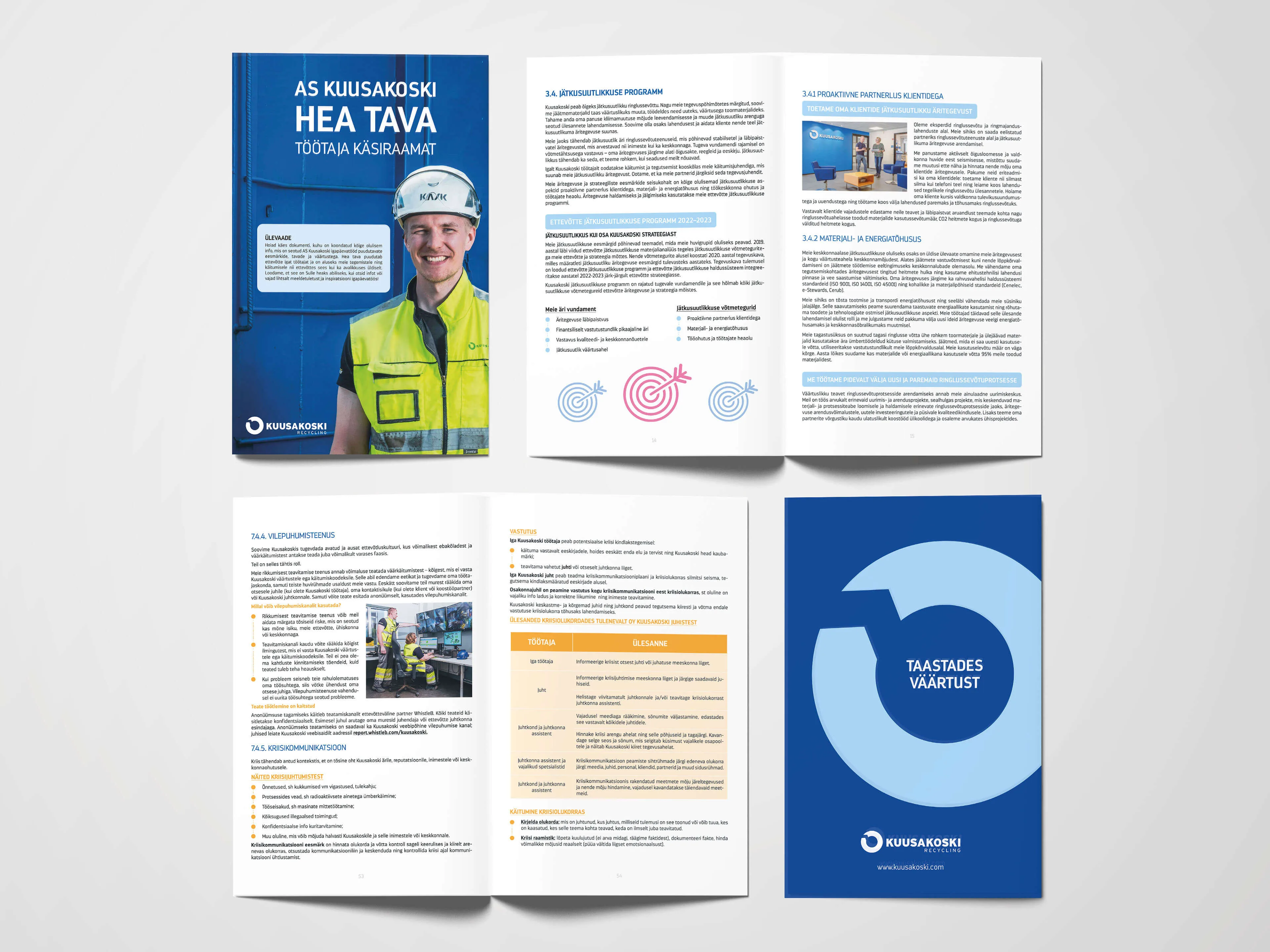
Portfolio examples: brochure, flyer and announcement.
Brochure formats: which one to choose?
First, you need to choose a format. In other words, brochure design starts with this very decision. Each format suits different purposes:
Most common formats
- A5 double-sided flyer — the simplest and cheapest. For example, ideal for events and product introductions. One sheet, two sides.
- DL (A4 tri-fold) — the classic brochure. Additionally, it fits in an envelope and works for mailing. 6 panels of content.
- A4 bi-fold (4 pages) — compact and professional. Especially suitable for service overviews.
- A4 tri-fold (6 pages) — more room for information. Consequently, great for product catalogues.
- A4 brochure 8–16 pages — a mini-catalogue. Suitable for larger companies, portfolios and also price lists.
- Square format (21×21 cm) — eye-catching and modern. Particularly suited for lifestyle brands.
How to choose?
Little info = flyer (A5/DL).
Service overview = 4–6 page leaflet.
Catalogue/portfolio = 8–16 page brochure.
In summary, if in doubt, start with the DL format — it's the most versatile.
Fonts (typography): what works in print?
It's important to understand that print rules differ from screen rules. Likewise, font choice affects readability, mood and professionalism.
Key rules
- Headlines: allow yourself bolder fonts — for instance, bold, condensed and display fonts work well. Specifically: Montserrat Bold, Playfair Display, Oswald.
- Body text: readability is king. Therefore, use serif fonts (Times, Garamond, Merriweather) or clear sans-serif fonts (Inter, Source Sans Pro, Open Sans). Minimum print size: 9 pt, ideally 10–12 pt.
- Maximum 2–3 fonts. Otherwise visual chaos ensues.
- Line height (leading): 120–150% of font size. More precisely, text that's too tight tires the eyes.
- Contrast: headlines must stand out. Therefore, use differences in size, weight (bold vs regular) and style (serif vs sans-serif).
⚠️ Mistake #1:
Decorative font in body text. In other words, what looks beautiful in a headline is unreadable in long text. Body text should be boring and readable.
Free vs paid fonts
- Free: Google Fonts — large selection of quality fonts. Inter, Montserrat, Lora, Playfair Display are all free and print-quality.
- Paid: MyFonts, Adobe Fonts (included with Creative Cloud) — premium fonts that set you apart.
- Is paid better? Not necessarily. Google Fonts' Inter is as good as many paid fonts. However, if your brand needs a unique feel, a paid font makes a difference.
Sizes and specs: what the print shop needs
- Bleed: 3 mm on each side. This is the area that gets trimmed — background colour and images must extend to it.
- Safe zone: 5 mm from the edge — text and logos must stay within this, or parts will be cut off.
- Resolution: 300 DPI (dots per inch). Web images are 72 DPI — they're not suitable for print!
- Colour model: CMYK, not RGB. Screen colours and print colours are different.
- File format: PDF/X-1a or PDF/X-4. Not JPEG, not PNG.
For more on print file preparation, read: Prepress Checklist →
Print-ready materials: brochure and flyer. All CMYK, 300 DPI, bleed included.
Tone of voice: how to speak in a brochure
Brochure tone depends on target audience and brand. Nevertheless, some universal rules always apply:
- "You", not "we". Talk about the client's needs, not yourself. "You get…", "This means for you…", not "We offer…".
- Short sentences. Print is scanned quickly, not studied deeply. Every sentence should be easy to digest.
- Specific > general. "Ready in 3 days" is better than "fast". "From €150" is better than "affordable".
- One message per panel. Each surface should do one thing well — not everything at once.
- CTA (call-to-action) must be clear. "Call +372 5605 7037" or "Scan QR code" — tell people what to do next.
Tone examples
❌ Not like this:
"Our company provides high-quality graphic design solutions that meet the highest quality standards and help your business grow."
✅ Much better:
"Your flyer is ready in 2 days. Print-ready, professional, and on-brand. From €80."
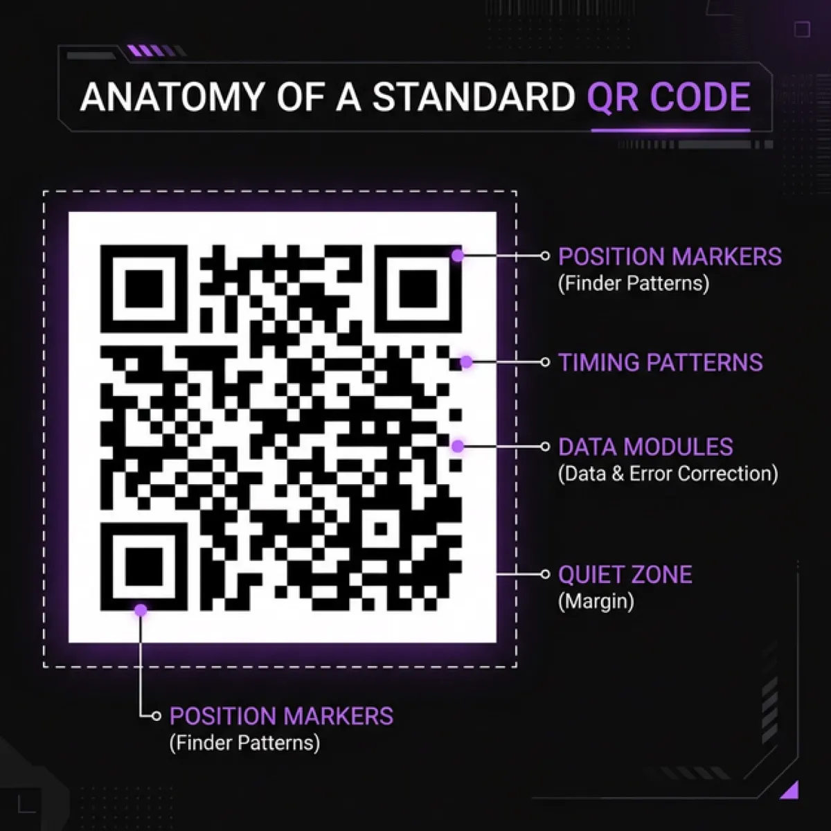
Using QR codes in brochures
In addition to visuals, a QR code is a bridge between the physical and digital worlds. It makes the brochure interactive and measurable. However, it only works when used correctly.
When to use a QR code
- Link to website or landing page — the client scans and lands on the right page.
- Contact info (vCard) — phone, email, address saved to phone instantly.
- Google Maps link — the client finds your location in seconds.
- Video — product demo or client testimonial.
- Booking link — calendar opens immediately.
QR code design rules
- Minimum size: 2×2 cm. Smaller ones may fail to scan.
- Contrast: dark code on light background. White code on black background works too, but test first.
- Don't place on images: busy backgrounds make scanning harder.
- Add explanation: "Scan to see portfolio" is much better than a bare QR code.
- Always test! Print a proof and scan with at least 3 different phones.
🔗 Creating QR codes
For detailed QR code instructions, see: QR Code Guide: Complete Tutorial →
Free vs paid design tools
Next, let's look at tools. There are both free and paid options for brochure design. Consequently, the choice depends on your skills and budget.
Free tools
- Canva (free + Pro €12/mo) — simple drag-and-drop with many templates. Good for quick flyers and social media visuals. Downside: limited typography, no CMYK export, print files require the Pro version.
- Figma (free) — professional design tool. Excellent typography, layouts and collaboration. Downside: no direct CMYK support, requires more design skill.
- Google Slides / PowerPoint — yes, you can make simple flyers with these. Downside: limited, non-professional results.
Paid (professional) tools
- Adobe InDesign (from €24/mo) — the gold standard for print design. CMYK, PDF/X export, master pages, long documents. If you create brochures regularly, this is the best choice.
- Adobe Illustrator (from €24/mo) — suitable for 1–2 page flyers and illustration-heavy materials.
- Affinity Publisher (one-time €75) — InDesign alternative without monthly fees. Excellent value for money.
Is a subscription worth paying for?
If you create brochures and print materials at least once a month, then yes — Adobe InDesign (€24/mo) or Canva Pro (€12/mo) pays for itself. If you only create materials occasionally (a few times a year), it's more sensible to order professional design externally. It comes out cheaper and the result is certainly better.
💰 Quick calculation:
Adobe InDesign 12 months = €288/year. In contrast, professional brochure design from SIA Design starts at €80 (flyer) and goes up to €700 (full catalogue). In summary, if you create materials 2–3 times a year, ordering from us is cheaper and the result is more professional.
Request a brochure quote →Brochure content structure: 6-panel trifold
Now let's look more specifically. The most common brochure format is DL (A4 tri-fold). Below is a typical content layout:
Front cover (panel 1)
- Logo + company name
- Main promise (1 sentence)
- Strong visual
- No detailed info!
Inside panels (panels 2–4)
- Panel 2: The problem you solve — describe the client's situation.
- Panel 3: The solution — your services/products, briefly and concretely.
- Panel 4: Proof — numbers, references, client quotes.
Back cover (panels 5–6)
- Panel 5: CTA + contact info (phone, email, address, QR code).
- Panel 6: Inner panel (in DL format, this is the first thing you see when opened) — ideal for price list or wow factor.
Core design rules
- Hierarchy: headline → subheadings → body text. The eye should see the most important things first.
- White space: don't fill everything. Air around text improves readability and creates a premium feel.
- Consistency: same colours, fonts and style throughout the brochure. Every panel should feel like part of the same family.
- Quality images: blurry phone photos kill professionalism. Use professional photos or illustrations. Unsplash and Pexels offer free quality images.
- Colours: use your brand colours. If you don't have them, limit yourself to 2–3 colours. One primary, one accent, one neutral.
Paper and print quality
Furthermore, paper affects the brochure's feel more than you'd think. Namely, heavy and quality paper signals premium service.
- Gloss: images appear brighter, colours more intense. Suitable for product catalogues and lifestyle brands.
- Matte: softer, elegant, professional. Suitable for service companies and consultancies. Text is easier to read.
- Weight: for flyers 170–200 g/m², brochure covers 250–350 g/m², inner pages 130–170 g/m².
- Laminate: matte laminate gives a premium feel. Gloss laminate protects against fingerprints.
Common brochure design mistakes
- Too much text. A brochure is not a book. Therefore, cut, cut, cut.
- Bad images. Even one blurry image ruins the entire material's professionalism.
- Missing CTA. Don't assume people know what to do — consequently, tell them directly.
- RGB colours in print. Screen colours and print colours are different. Therefore, use CMYK.
- Missing bleed. Without bleed, white edges appear.
- Too many fonts. 2–3 fonts are enough, not 6.
- QR code without explanation. Just "scan" isn't enough — also tell people what they'll get.
Pre-print checklist
- ☐ File is in CMYK colour model
- ☐ Resolution at least 300 DPI
- ☐ Bleed 3 mm on each side
- ☐ Text is within safe zone (5 mm from edge)
- ☐ Fonts are embedded / outlined
- ☐ File is PDF/X-1a or PDF/X-4
- ☐ Images are sufficient quality (not downloaded from web)
- ☐ QR code works (tested with 3 phones)
- ☐ Typos checked (have someone else read it!)
- ☐ Contact info is correct and up to date
Print preparation seems complex? We'll handle it for you. See: Prepress Service →
How much does brochure design cost?
Ultimately, the price depends on format, number of pages and content readiness:
- Flyer (A5/DL, double-sided): €80–180
- Brochure (4–6 pages): €150–350
- Brochure (8–16 pages): €300–700
- Prepress (if design exists): €35–90
Prices include design, revision rounds and print-ready PDF. Printing is separate (print shop prices).
🎁 Special offer for readers!
Use code IWANTBROCHURE50 and get €50 off your next brochure or flyer.
Offer valid until 31.05.2026 (inclusive).
Use promo code →
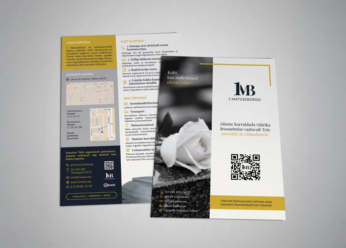
Our work: brochure, flyer and announcement. All print-ready and on-brand.
FAQ: Brochure Design
Can I make a professional brochure with Canva? +
For simpler materials yes, especially with Canva Pro. But CMYK colour profiles, precise typography and print standards are limited. If the brochure needs to be truly professional, we recommend using InDesign or ordering from a designer.
How quickly can I get a brochure? +
From SIA Design you get a finished design in 2–5 business days, depending on volume. Simple flyer: 1–2 days. Brochure (up to 10 pages): 4–10 business days. Printing adds usually 2–5 business days.
What info does a designer need? +
Ideally: text, images, logo, colours and font preferences. But if you don't have those, we'll help structure everything. An idea, target audience and goal are enough.
Does a digital brochure (PDF) work too? +
Yes! A digital PDF brochure is great for emailing, website downloads and social media linking. Plus interactive QR codes and links directly in the PDF.
Need a brochure, flyer or leaflet?
We create professional print materials from €80. Design + prepress + files for the print shop. Fast, clean and on-brand.
🎁 Code IWANTBROCHURE50 = €50 off! Valid until 31.05.2026.
Get a quote →SIA DESIGN
Design and web development
The SIA DESIGN team writes practical guides on web design, development and SEO.
Learn more about the SIA DESIGN team →