Why Minimalism Is Still King in 2026
In an age of information noise, clarity is luxury. Why minimalist design wins in 2026 and how “white space” works.

The world is loud. Your website doesn’t have to be. In 2026 users value time and clarity above all. Minimalism is no longer just a style — it’s respect for the user’s cognitive resources. It’s a strategic tool that focuses attention and increases sales.
Cognitive health and decision fatigue
Every element on your website demands attention: every image, every button, every line of text. That loads the brain. Psychology calls this “cognitive load.”
Miller’s law says people can hold about 7 items (plus/minus 2) in short‑term memory. If your menu has 15 options, the user’s brain overheats.
Hick’s law:
“The more choices, the longer the decision takes.”
When overload is too high, the “paradox of choice” kicks in — the user can’t decide and leaves. Minimalist design removes the non‑essential and keeps only what helps the user reach the goal.
White space isn’t empty space
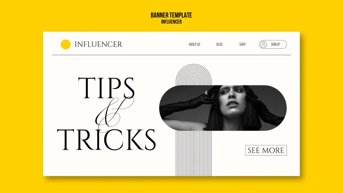
Many clients fear empty space. “Why is there so much emptiness? Put an ad or another image here!” That’s a mistake. White space is a design element just as important as content itself.
Why space works
- Focus: Place one button in the middle of white space and it’s impossible not to notice it. Space guides the eye.
- Comprehension: Studies show spacing between text (line‑height and margin) improves readability and understanding by up to 20%.
- Luxury: Look at luxury brands (Rolex, Apple, Tesla). Their sites are airy. Cheap news sites are crammed with banners. Space = exclusivity.
Speed is the SEO foundation (Core Web Vitals)
Minimalism means less code — fewer files the browser must download.
Google’s 2026 algorithm prioritizes load speed and stability (INP — Interaction to Next Paint). Every millisecond counts.
Non‑minimal site
- 15 different fonts and styles
- Heavy background videos
- 3 different analytics scripts
- Complex shadows and effects
- Load time: 4.5 seconds ❌
Minimal site
- 1–2 well‑chosen fonts
- Optimized SVG graphics
- Clean code (Tailwind CSS)
- Fewer, but better images
- Load time: 0.8 seconds ✅
Mobile‑first and the “thumb zone”
Minimalism is essential on mobile. Screen space is limited.
We design around the thumb zone — the bottom area of the screen your thumb can comfortably reach. All critical buttons (“Buy,” “Menu,” “Call”) should live there. The top corners are hard to reach, so we place only the logo or less important info there.
5 signs your site is too noisy
- More than 3 colors: Use the 60‑30‑10 rule. 60% base color (e.g. black/white), 30% secondary, 10% accent (e.g. neon‑green button).
- Carousels (sliders): No one watches them. They slow the page and hide content. Use one strong hero image.
- Pop‑ups: If a user must close 3 windows (“Cookies,” “Join our newsletter,” “Discount”) before seeing content, they leave.
- Long text blocks: People don’t read, they scan. Use subheadings and lists.
- Auto‑playing music/video: Absolute taboo in 2026.
FAQ
Does minimalism mean a boring site? +
No. Minimalism highlights content. If your products or photos are boring, the site will be boring. If you have great visuals, a minimalist frame lets them shine.
Can I use colors? +
Yes. Minimalism isn’t only black and white. It means *controlled* color use. 90% of the page can be neutral so the 10% accent has real impact.
Is it suitable for every business? +
Almost. It’s especially strong for premium services (lawyers, architects, IT) and ecommerce. Discount stores often use the opposite tactic (controlled chaos) to create a “deal” feel.
Make your web noise‑free?
We remove the noise and spotlight what truly matters — your product and message. Clean design sells better and loads faster.
See design services →Angelina
Graphic designer / prepress
Graphic designer and prepress specialist with 5+ years of experience. Strong in branding, print materials, books and complete print workflows.
Learn more about the SIA DESIGN team →

