Dark Mode: A Mandatory Standard by 2026
90% of users prefer dark mode. Why it saves battery and eyes, and why a glaring white site can drive customers away.
Have you tried looking at a bright phone screen in a dark room? It hurts. In 2026 Dark Mode is an expectation, not a feature. If your website lacks a dark version, you’re behind. It’s as basic as making sure the site works on mobile.
Battery savings are green thinking
Most modern devices (iPhones, Samsungs, even laptops) use OLED or AMOLED displays. Unlike old LCD screens that need constant backlight, OLED screens work pixel by pixel.
Pixels and power:
A pure black pixel (#000000) is off on OLED. It consumes no energy. Google studies show Dark Mode can save up to 60% battery at max brightness. For eco‑conscious customers, that’s a real selling point — your website “uses” less of their battery.
Health and readability (the human factor)
We spend more time in front of screens than ever. “Computer Vision Syndrome” (eye strain) is real.
A dark background with light‑gray text reduces eye strain, especially in the evening, and preserves melatonin production. Melatonin is the sleep hormone that blue light (which white screens emit) suppresses. Your website can literally help customers sleep better.
Premium feel and branding
Why are Spotify, Netflix and most investing apps (LHV Trader, Robinhood) dark?
- Focus on content: A dark background lets colorful album covers or posters pop.
- Luxury: Dark is associated with elegance, mystery and exclusivity. Think expensive cars or evening gowns.
- Less noise: White reflects ambient light, dark absorbs it, creating a more intimate experience.
How to design a good dark mode
Simply inverting colors doesn’t work. Here are the rules we follow at SIA:
1. Don’t use pure black (#000000)
Pure black causes OLED “smearing” when scrolling. The contrast with white text is also too harsh. We use dark grays (e.g. #121212) that are easier on the eyes.
2. Desaturate colors
The same blue that works on white is too bright and vibrating on dark. In dark mode you must reduce saturation (pastel tones) to keep readability and WCAG AA compliance.
3. Create depth with layers
In light design we use shadows for depth. In dark design shadows are invisible. Instead we use elevation: the higher the element, the lighter its background.
Technical implementation (CSS)
We don’t force users to choose — we read system preferences. If their phone is in dark mode, our site automatically follows.
:root {
--bg-color: #121212;
--text-color: #E0E0E0;
}
}
With Tailwind CSS it’s even easier. We build components like bg-white dark:bg-slate-900 so the transition is smooth and automatic.
FAQ: Dark mode
Is dark mode more expensive to build? +
Yes, a bit. It requires double work (two palettes). But the investment pays off in better UX.
Can I add a toggle button? +
Absolutely. We often add a small sun/moon icon in the header so users can override the automatic setting.
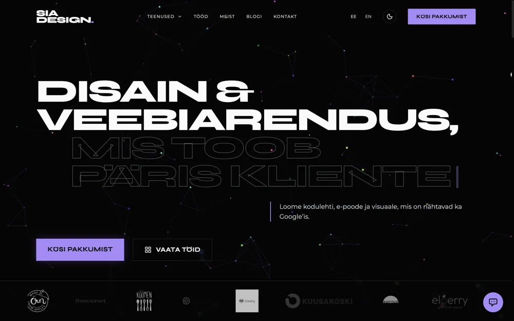
Does your site support dark mode?
Build a website that respects system preferences and saves users’ eyes. Dark is the new black.
Order a modern web solution →Angelina
Graphic designer / prepress
Graphic designer and prepress specialist with 5+ years of experience. Strong in branding, print materials, books and complete print workflows.
Learn more about the SIA DESIGN team →